What painting for an entryway
You pass through it for ten seconds a day and never sit down there. That's exactly why an entryway can carry the image a living room would refuse.
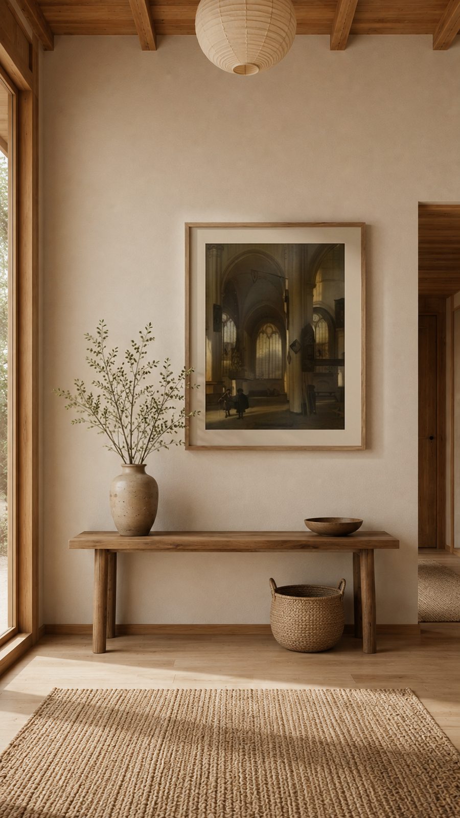
The room you don't linger in
An entryway isn't a place to settle in, it's a passage. No one studies a painting there for twenty minutes. That completely changes the brief: the image has to work in a second and a half, seen at an angle, often while walking.
There's a real upside to that. A demanding image, dark, a little austere, one that would weigh down a living room you spend your evenings in, is perfectly at home here. You pass it, take it in, and move on.
Depth against narrowness
Most entryways suffer from the same flaw: width. A 120 cm corridor, a wall facing the door, nothing else. A flat image only makes the tunnel feeling worse.
What helps is a work that contains depth: a perspective, a receding row of columns, a painted corridor. The eye steps into the image and the wall recedes. It's the one place in the house where this choice is genuinely useful rather than merely decorative.
Above a console table
With a console table, apply the furniture rule: 20 to 30 cm between the tabletop and the bottom of the frame, and an image width between half and two-thirds the width of the console.
Without a console, go back to eye level: center of the piece at 155 cm off the floor. In a narrow hallway, drop even to 150 cm, since you stand closer to the wall there and tend to look slightly downward while walking.
The dark frame, for once
In a bright entryway, a black or very dark moulding acts like punctuation. It stops the eye at the right spot in a space that, by definition, has no other anchor point.
White, on the other hand, blends into the wall and makes the hanging disappear. That's a legitimate choice elsewhere, rarely here: in a passage, an image that doesn't announce itself will never be seen.
Why this de Witte belongs here
Emanuel de Witte's Interior of a Church is a depth machine: columns receding into the distance, light coming from the far end, architecture that carves depth into the very wall it hangs on. Exactly what a hallway calls for.
The blacks stay matte and deep on the metallic sheet while the light at the far end keeps its glow. Black frame, hand-framed in Europe, delivered ready to hang.