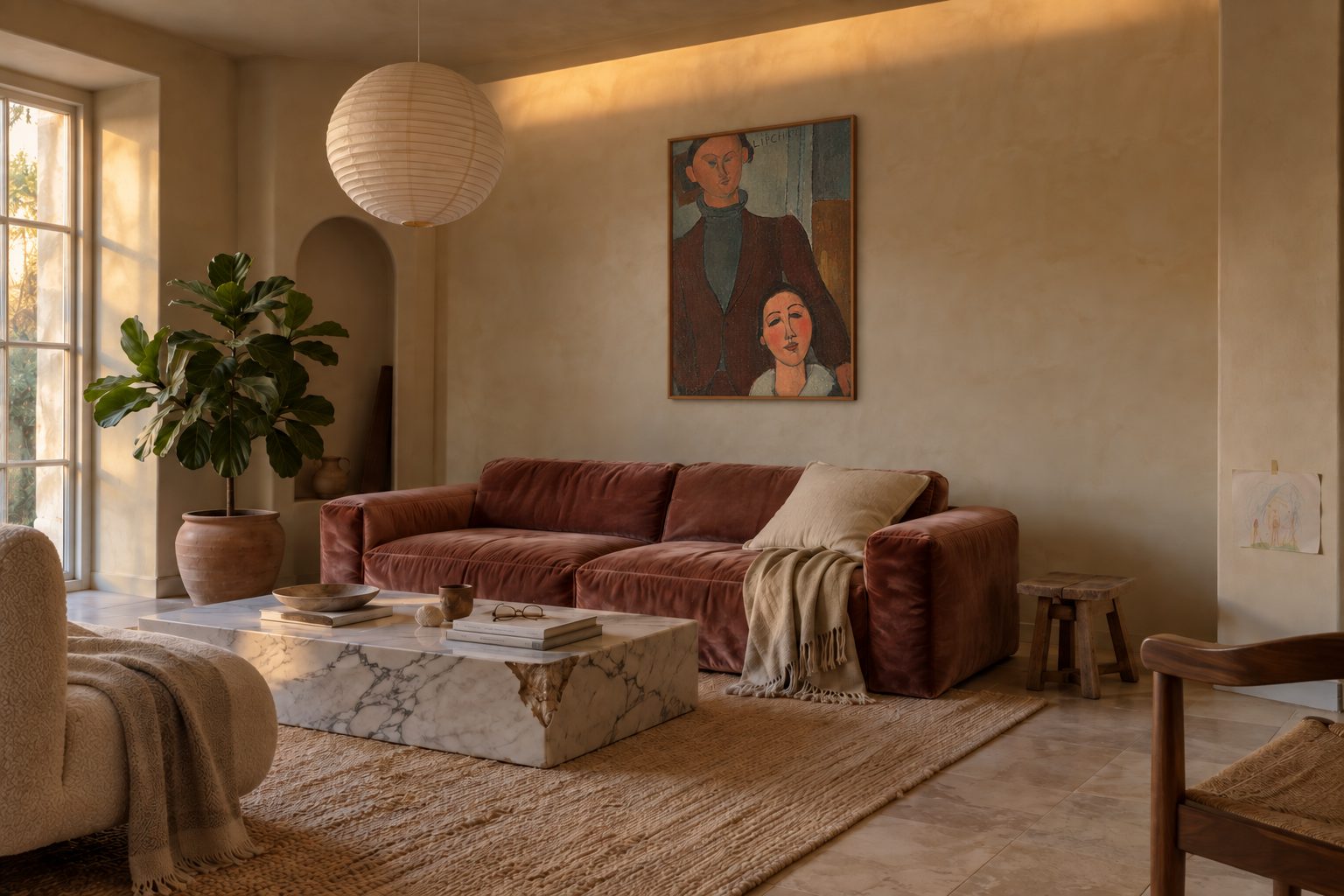
Should a painting go inside an arched niche?
No: the niche keeps its own object, and a piece like this Modigliani double portrait belongs on the flat wall right next to it, above the sofa.
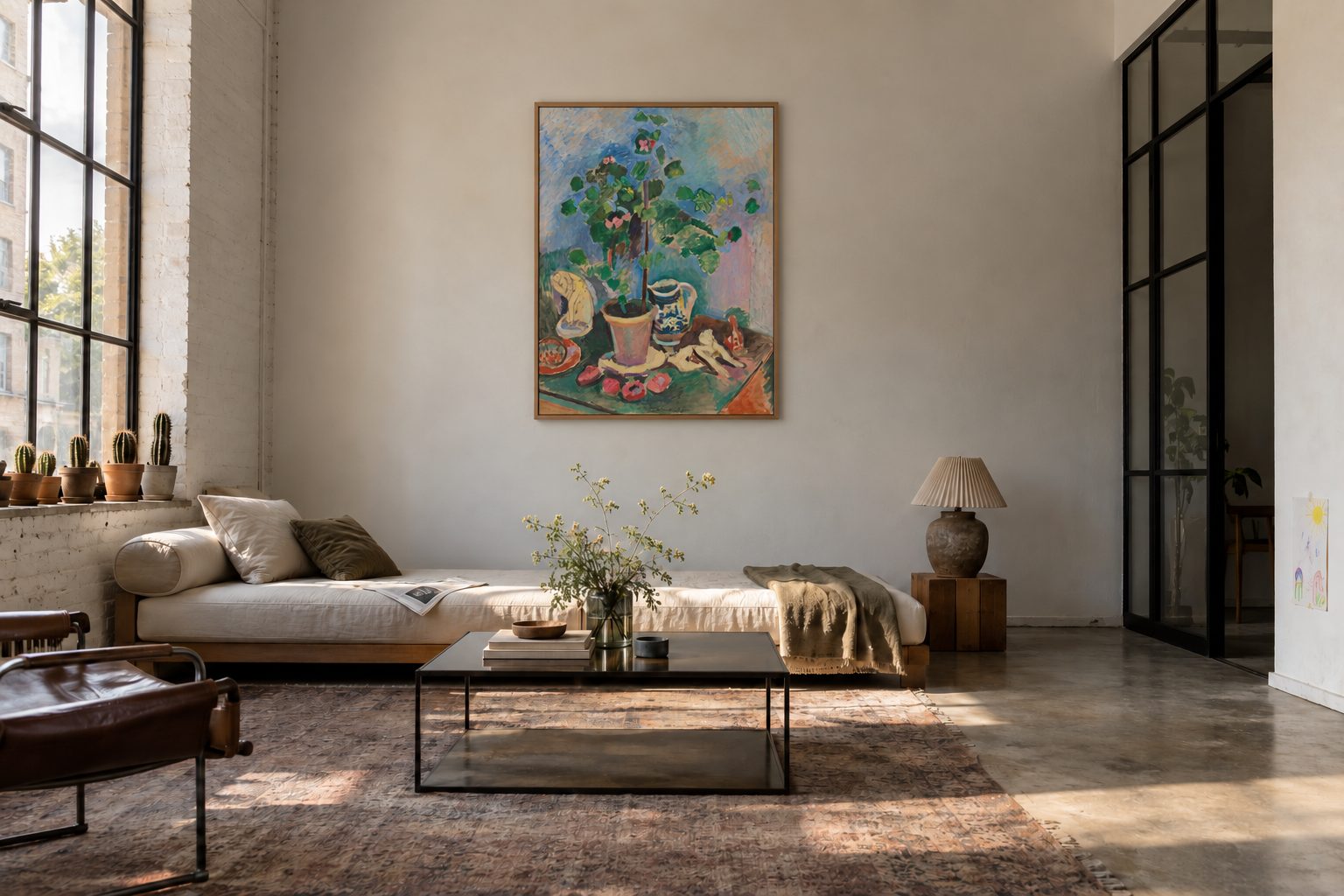
Composing several paintings above a sofa
One painting above the sofa is a settled question. Three is a question of rhythm: which piece leads, how much space between the frames, and where the composition stops before it spills across the wall.

What to hang above a dining room sideboard
A Dutch still life on a sideboard: Kalf's picture from the Cleveland Museum of Art, at what height, in which size and frame, and at what furniture width you need two.
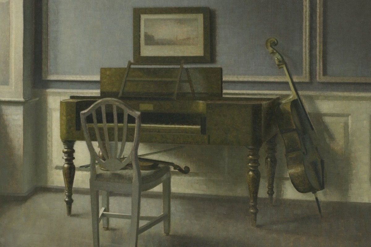
What to hang in a narrow hallway
A hallway is walked through, not viewed from afar. A Hammershøi from the Art Institute of Chicago to show which size, height and frame to choose when you cannot step back.
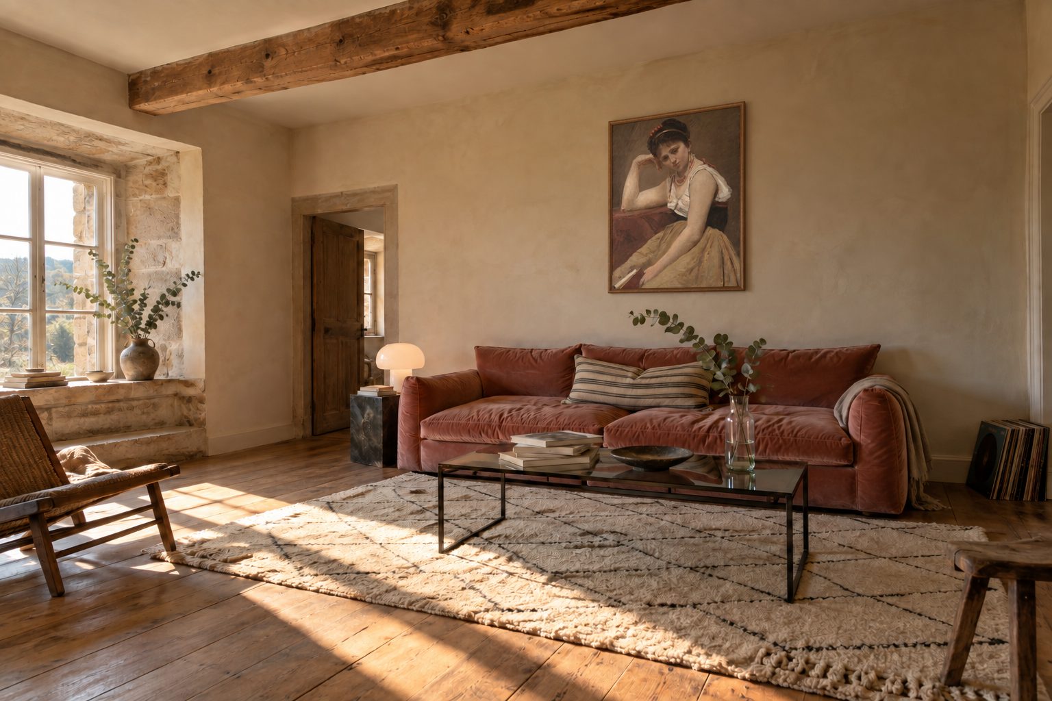
Corot's Interrupted Reading in a country living room
A lime-washed wall, a velvet sofa, a woman looking up from her book. Corot's Interrupted Reading doesn't need a grand salon to belong, just a quiet wall and the right height.
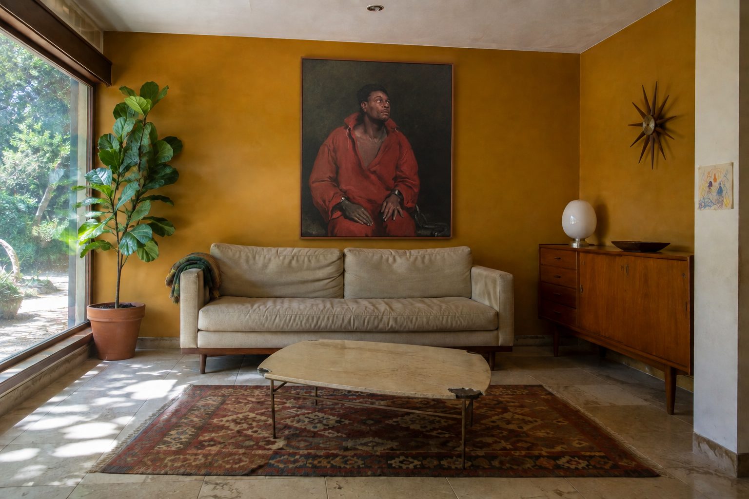
A portrait that holds your gaze
Some paintings decorate, others watch. The portrait of Ira Aldridge painted by John Philip Simpson in 1827 belongs to the second kind, and that's exactly what earns it a place in a living room.
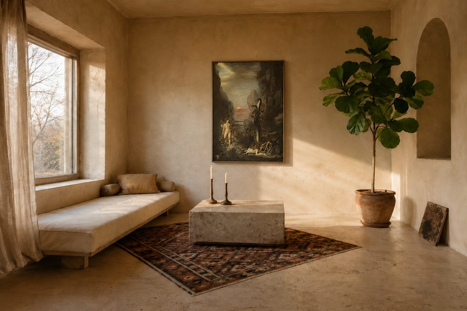
Mythological art above the sofa?
Mythological scenes have a reputation for being too much for a living room. That's true of the bad ones. The great ones, like Gustave Moreau's Hercules, do the exact opposite: they hold the wall and leave the room at peace.
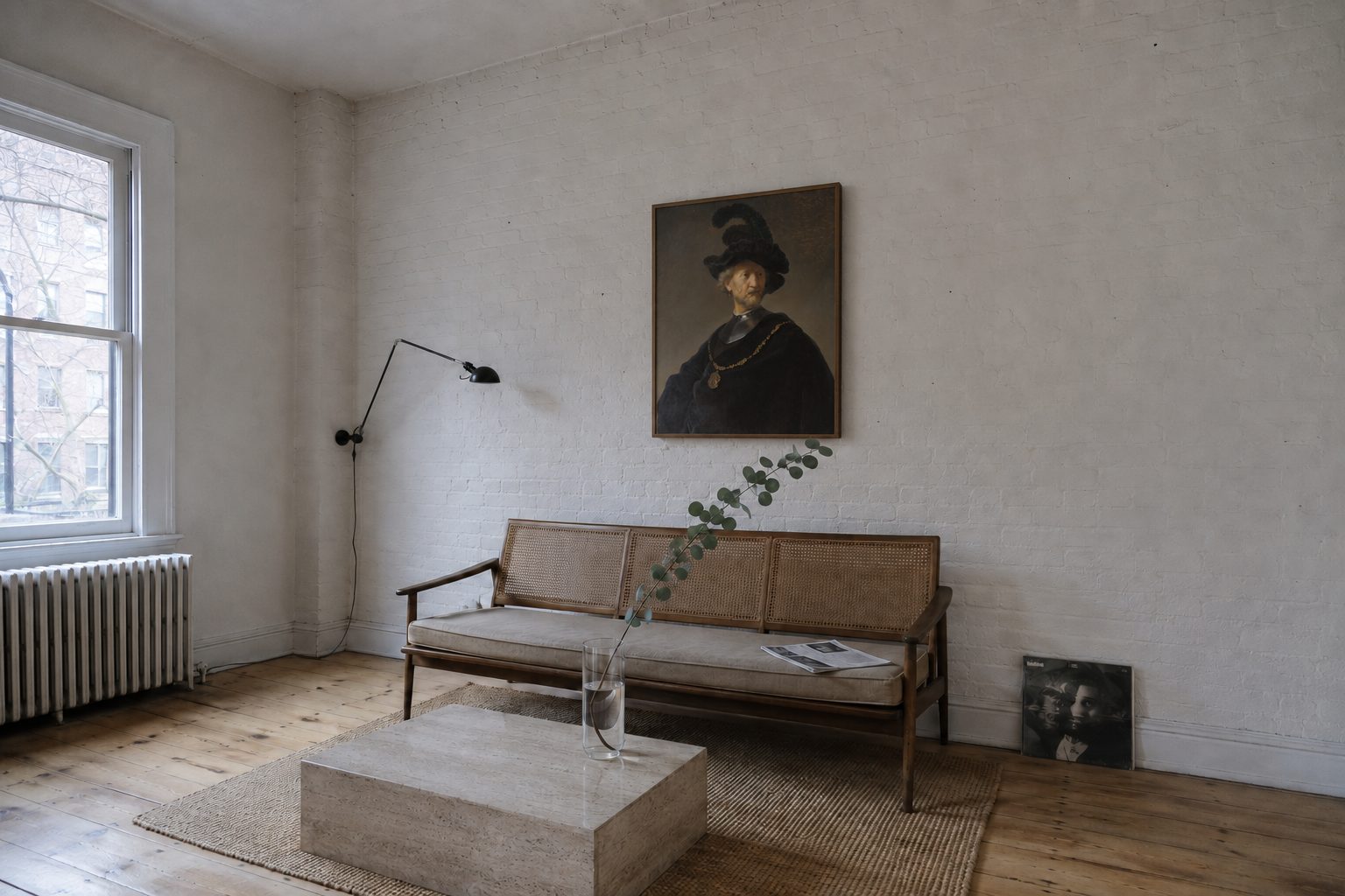
An old master in a modern interior?
It's the question we get asked most, always with the same worry: won't it clash? Here's the answer, with a 1631 Rembrandt on a whitewashed brick wall.
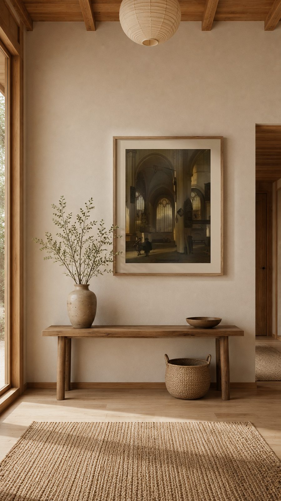
What painting for an entryway
You pass through it for ten seconds a day and never sit down there. That's exactly why an entryway can carry the image a living room would refuse.
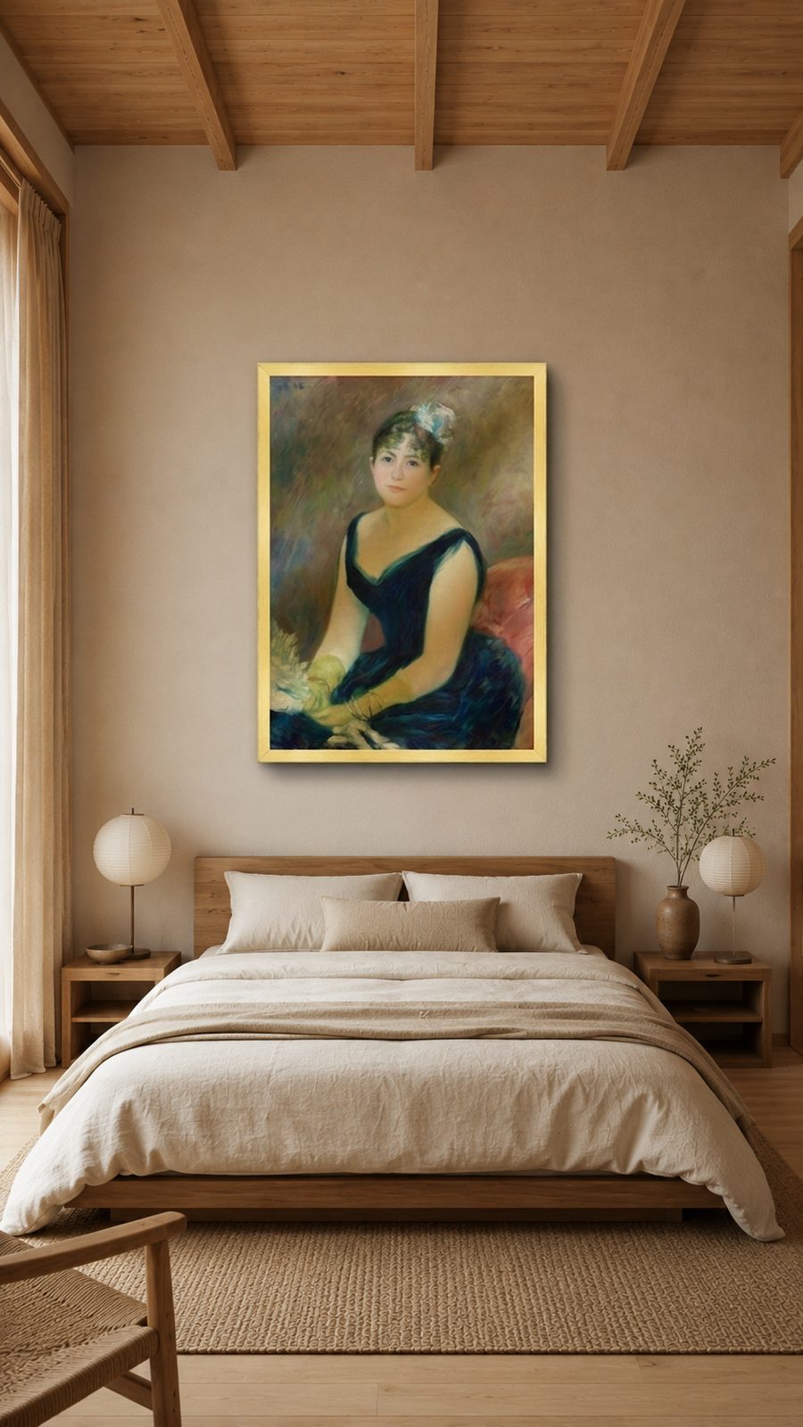
What painting above the bed
It's the only wall in the house you look at lying down, and the only one you never see in full. Two constraints that rule out half the images.
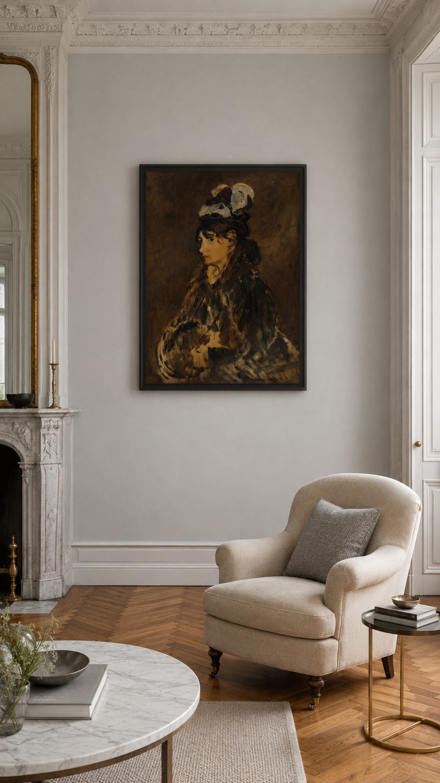
What painting for a Haussmannian apartment
Moulded cornices, a marble mantel, herringbone parquet: the decor is already written. The question isn't what to add, it's where to put the one thing that's missing.
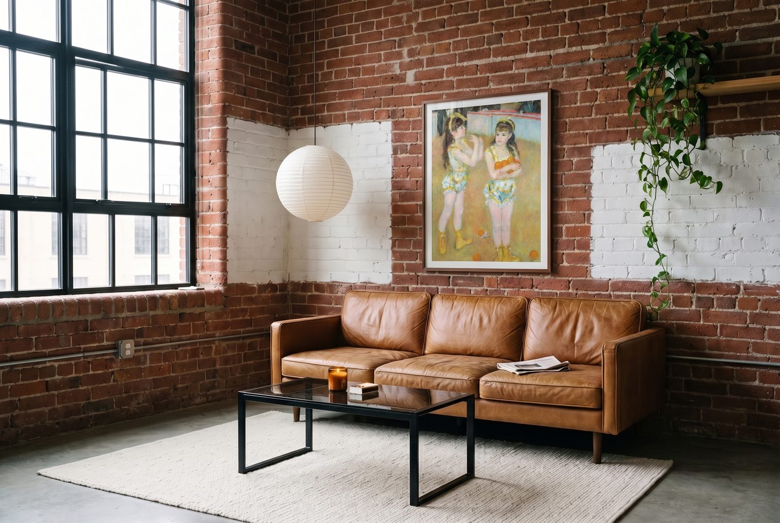
What painting for a brick wall in a loft
Brick is already a material, a color, and a rhythm. You don't hang on it the way you'd hang on a white wall, and half the images that work elsewhere disappear on it.
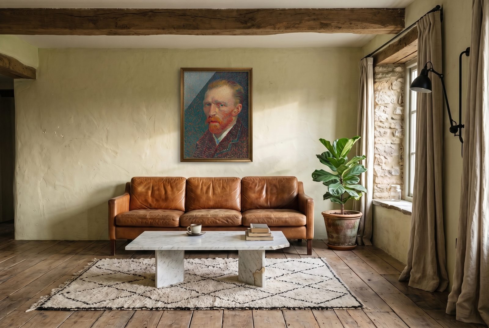
Where to hang a portrait in a country living room
A landscape looks at nothing. A portrait does, and that changes everything about where you hang it.
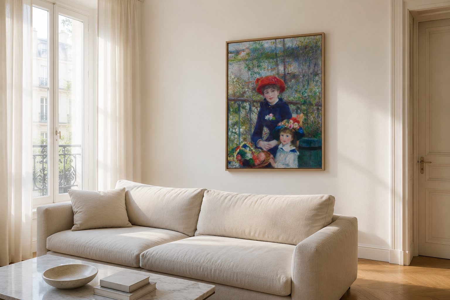
What painting above the sofa in a bright living room
A wide wall, low seating, plenty of light. The sofa wall gets it wrong more often than right, and it's almost always the same mistake.